A Guide to Photographing Abandoned Places - by Mike Busby Photography
 |
| Alone - © 2015 Mike Busby Photography |
First and foremost – abandoned places once thrived with human life and values, but for whatever reasons, those values were lost and became disconnected. It's these values that cross the span of time and resonate with your viewers. This is intuitive, but once we identify the nature of human interest, we can then look for the design elements that foster them.
 |
| Moonlight on Time - © 2013 Mike Busby Photography |
The passing of time resonates with abandoned places. Framing your subject with a greater theme is an easy and quick way to emphasize time. Greater themes are things that existed before us, and things that will live beyond us. They become divine because they transcend the human lifespan. The sun, the moon, the stars, and dramatic clouds are some examples. Greater themes act through their sense of divinity, and the frame amplifies their nature with the humanness of your subject.
 |
| Waiting - © 2014 Mike Busby Photography |
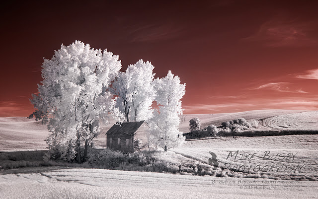
Isolation is another element. It can occur by photographing a lone building in a vast landscape. In the case of this photo, modern telephone poles, wires, and barns narrowed the sense of time to the present. Removing those anchors enables the viewer to reframe the center of interest against the greater themes projected by the clouds. The removed items were in the distance, and they were small things, but their absence does enhance the feel of the image.
Decay is an interesting element - the greater the sense of decay, the greater the sense of the passage of time. Decay is typically found in the textures of decomposing things. In this image, decay is represented by the near collapse of a building on Rte 66. The sunset acts as a greater theme, and the image was slightly distorted to emphasize its eventual collapse.
 |
| Out There, in Blue - © 2014 Mike Busby Photography |
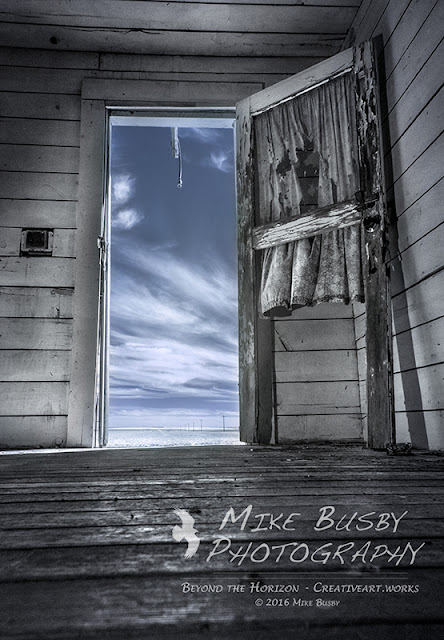
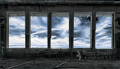
There is a whole psychology with forcing the viewer into the same position as the people who lived and worked in abandoned places. For those of you who like shooting doors and windows, know that you are contrasting the confined feelings of a place against the sense of freedom felt with open spaces. In essence, you are encouraging the viewer to ponder the future from a place in the past.
 |
| Sunset on Time -© 2013 Mike Busby Photography |
I want the reader to know that I didn’t abstract these thoughts, and then go out and shoot them. I explored, intuited, and composed them first – just like anyone else. As time moved on, I read material that spoke to the images, and it allowed me to articulate their meaning into design elements. It became a process that transfers experience of feeling into design elements, and it encouraged me to find the language to speak to them.
 |
| View - © 2013 Mike Busby Photography |
More than anything I want the reader to think about their subjects and ask questions about what aspects appeal to them. Try to think in emotion, and try to identify the specific design elements fostering their interest. They key is to identify and articulate the design element. Once revealed, you will find yourself searching, composing, and processing for them. Strength will naturally form through cycles of exploration and reflection.
Mike Busby
Mike Busby Photography
(509) 995-2954

Nice article Mike. Love your use of words and images.
ReplyDeleteThanks Ira....You may notice a certain format that seems to have carried forward from Photomedia.
DeleteThanks for the food for thought and the education.
ReplyDelete